Chapter 18 Normal distributions
This exposition is based on Diez et al. 2015, OpenIntro Statistics (3rd Edition) and Whitlock and Schluter, 2015. The Analysis of Biological Data (2nd Edition).
18.1 Basics about normal distributions
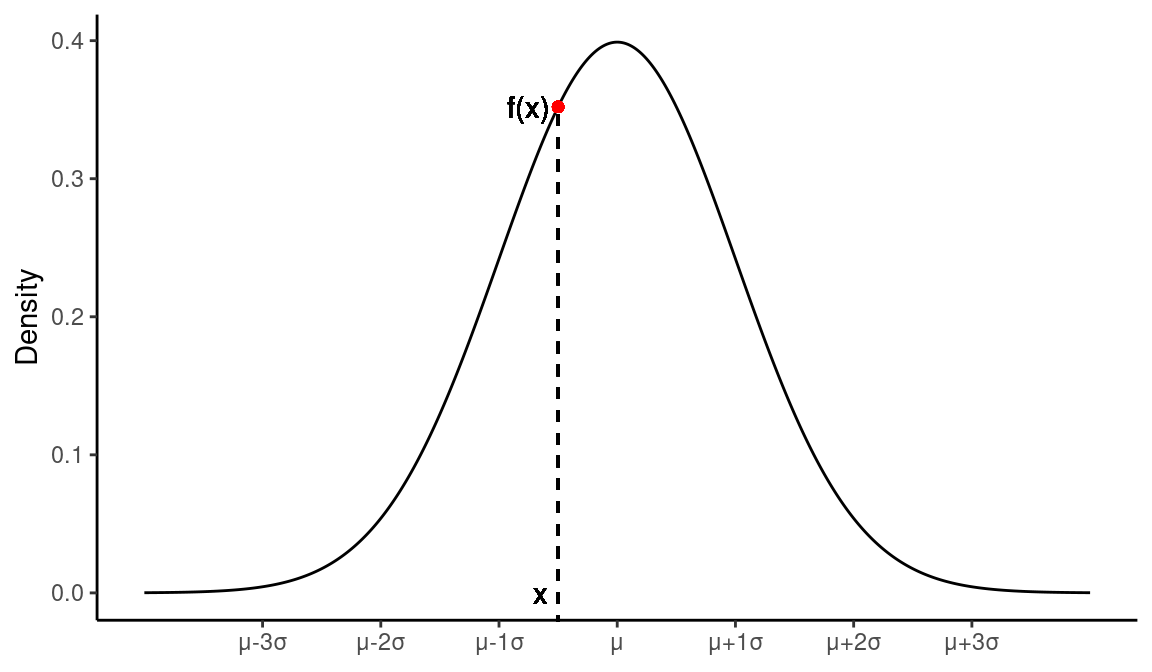
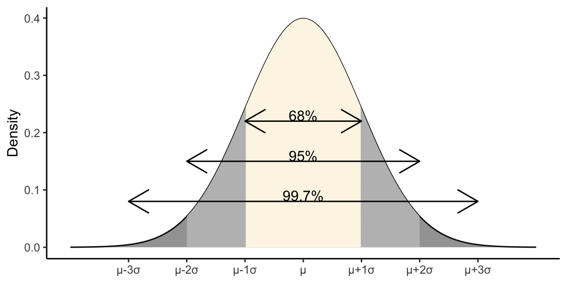
Figure 18.1: A normal distribution with mean μ and standard deviation σ
Normal distributions are:
- Unimodal
- Symmetric
- Described by two parameters – \(\mu\) (mean) and \(\sigma\) (standard deviation)
18.2 Normal distribution, probability density function
The probability density function for a normal distribution \(N(\mu,\sigma)\) is described by the following equation:
\[ f(x|\mu,\sigma) = \frac{1}{\sigma\sqrt{2\pi}}e^{-\frac{(x-\mu)^2}{2\sigma^2}} \]
18.3 Approximately normal distributions are very common
The normal approximation is a good approximation to patterns of variation seen in biology, economics, and many other fields.
The following figure, from your texbook, shows distributions for (a) human body temperature, (b) university undergraduate brain size, and (c) numbers of abdominal bristles on Drosophila fruit flies:
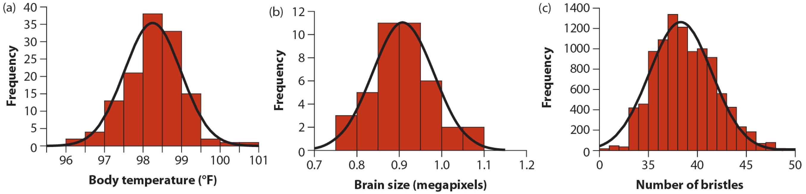
Figure 18.2: Examples of biological variables that are nearly normal. From Whitlock and Schluter, Chap 10
18.4 Central limit theorem
Why is the normal distribution so ubiquitious? A key reason is the “Central Limit Theorem”
The Central Limit Theorem (CLT) states the sum or mean of a large number of random measurements sampled from a population is approximately normally distributed, regardless of the shape of the distribution from which they are drawn.
Many biological traits can be thought of as being produced by the summation many small effects. Even if those effect have a non-normal distribution, the sum of their effects is approximately normal.
18.4.1 Example: Continuous variation from discrete loci
Studies of the genetic basis of traits like height or weight, indicate that traits like these have a “multigenic” basis. That is, there are many genomic regions (loci) that each contribute a small amount to difference in height among individuals.
For the sake of illustration let’s assume there are 200 loci scattered across the genome that affect height. And that each locus has an effect on size that is exponentially distributed with a mean of 0.8cm, and that an individuals total height is the sum of the effects at each of these individual loci.
In the figure below, the first plot show what the distribution of effect sizes looks. This is quite clearly a non-normal distribution. The second plot show what the distribution of heights of 100 individuals generated using the additive model above would look like. This second plot is approximately normal, as predicted by the CLT.
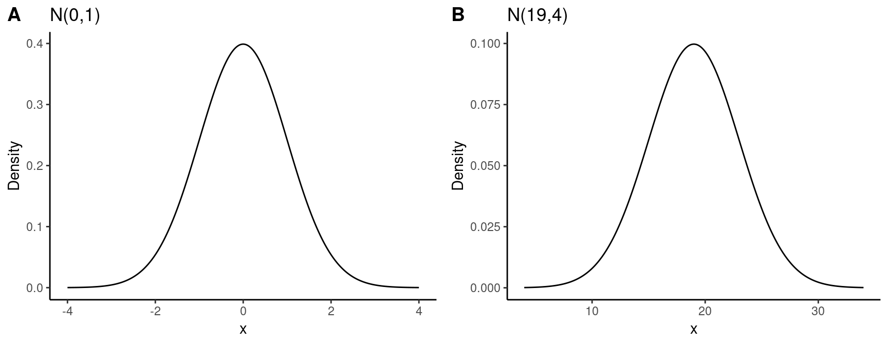
18.5 Visualizing normal distributions
- Different normal distributions look alike when plotted on their own scales
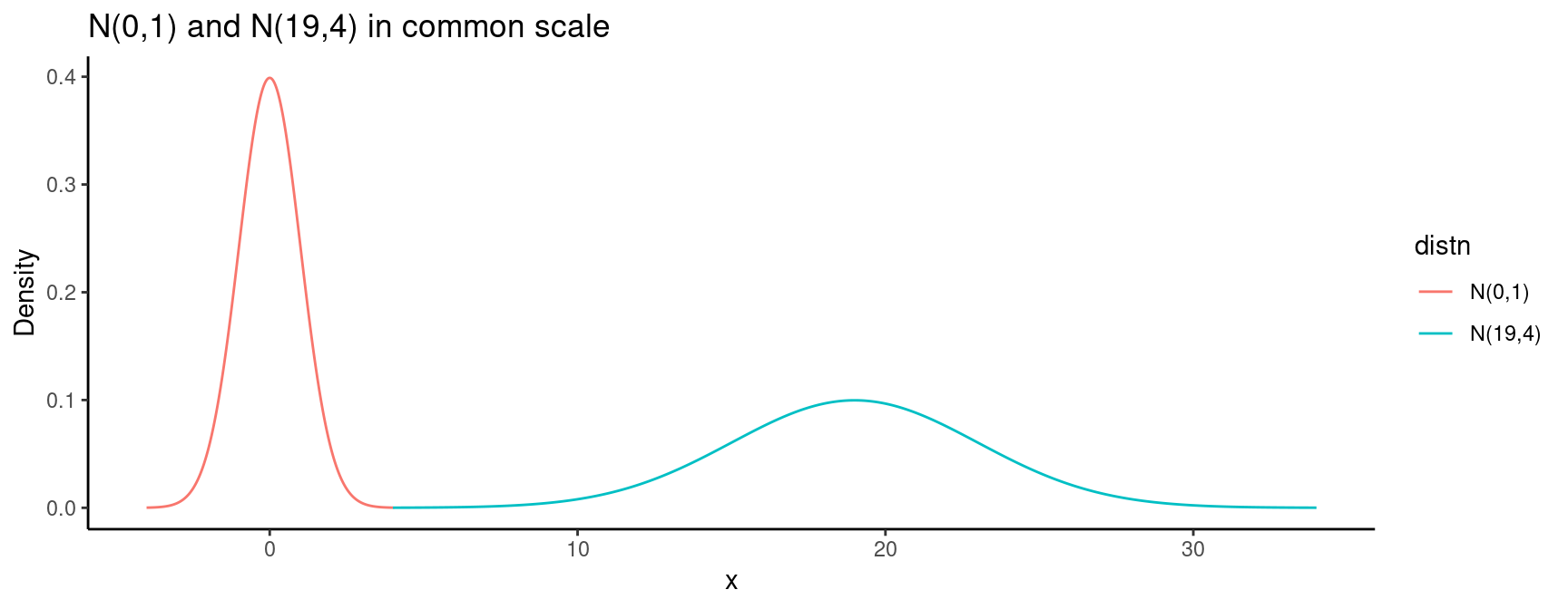
- Must plot normals on a common scale to see the differences
18.6 Comparing values from different normal distributions
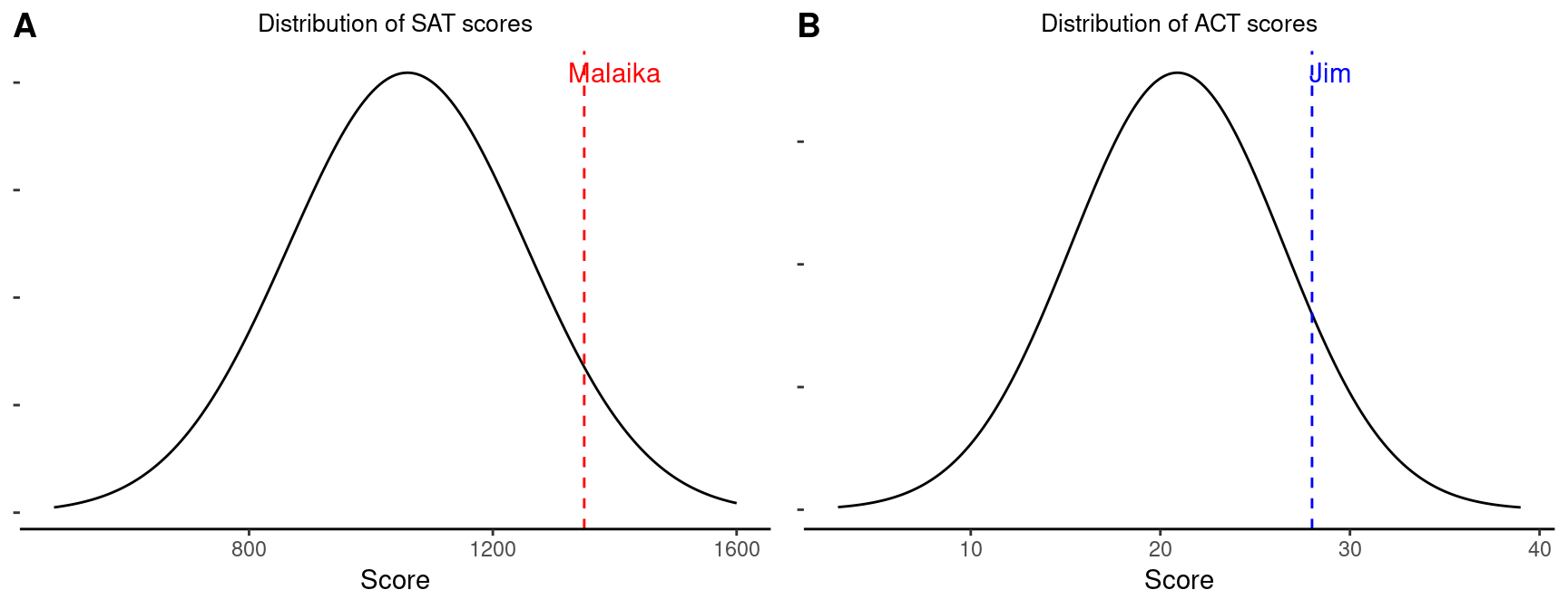
Q: SAT scores are approximately normally distributed with a mean of 1060 and a standard deviation of 195. ACT scores are approximately normal with a mean of 20.9 and a standard deviation of 5.6. A college admissions officer wants to determine which of the two applicants scored better on their standardized test with respect to the other test takers: Malaika, who earned an 1350 on her SAT, or Jim, who scored a 28 on his ACT?
A: Since the scores are measured on different scales we can not directly compare them, however we can measure the difference of each score in terms of units of standard deviation
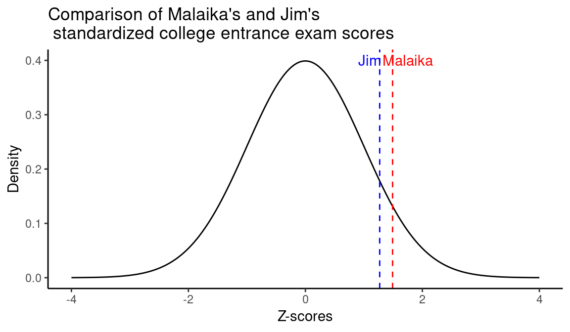
18.6.1 Standardized or Z-scores
Differences from the mean, measured in units of standard deviation are called “standardized scores” or “Z-scores”
The Z score of an observation is the number of standard deviations it falls above or below the mean. \[ Z_i = \frac{x_i - \mu}{\sigma} \]
For our SAT/ACT example above:
\[\begin{align} Z_\text{Malaika} &= \frac{1350 - 1060}{195} = 1.49\\ \\ Z_\text{Jim} &= \frac{28 - 20.9}{5.6} = 1.27\\ \end{align}\]
In this case, Malaika’s score is 1.49 standard deviation above the mean, while Jim’s is 1.27. Based on this, Malaika scored better than Jim.
18.7 Standard normal distribution
If \(X \sim N(\mu,\sigma)\) then the standardized distribution, \(Z_X \sim N(0,1)\). If \(X\) is normally distributed, then the Z-scores based on \(X\) have a mean of 0 and a standard deviation of 1.
\(N(0,1)\) is known as the standard normal distribution
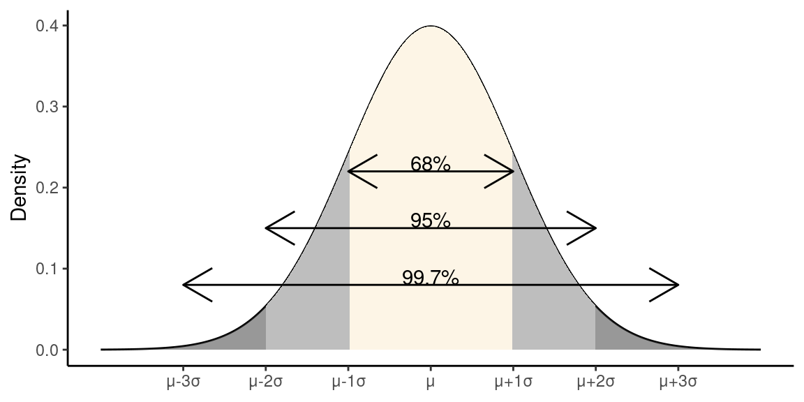
18.8 88-95-99.7 Rule
If data are approximately normally distributed:
- ~68% of observations lie within 1 SD of the mean
- ~95% of observations lie within 2 SD of the mean
- ~99.7% of observations lie within 3 SD of the mean
18.9 Percentiles
The percentile is the percentage of observations that fall below a given point, \(q\)
In R, for a normal distribution the fraction of observations below a given point (the probability that a random observation drawn from the distribution is less than the given value) can be calculatedusing the
pnorm(q, mu, sigma)function:
Therefore, Malaika is approximately at the 93-percentile. Note that we didn’t have to include the mean and standard deviation in the call to pnorm because we’re dealing with standardized scores, and the defaults for pnorm are mean = 0 and sd = 1. A similar calculation would show that Jim’s percentile is 89.7957685.
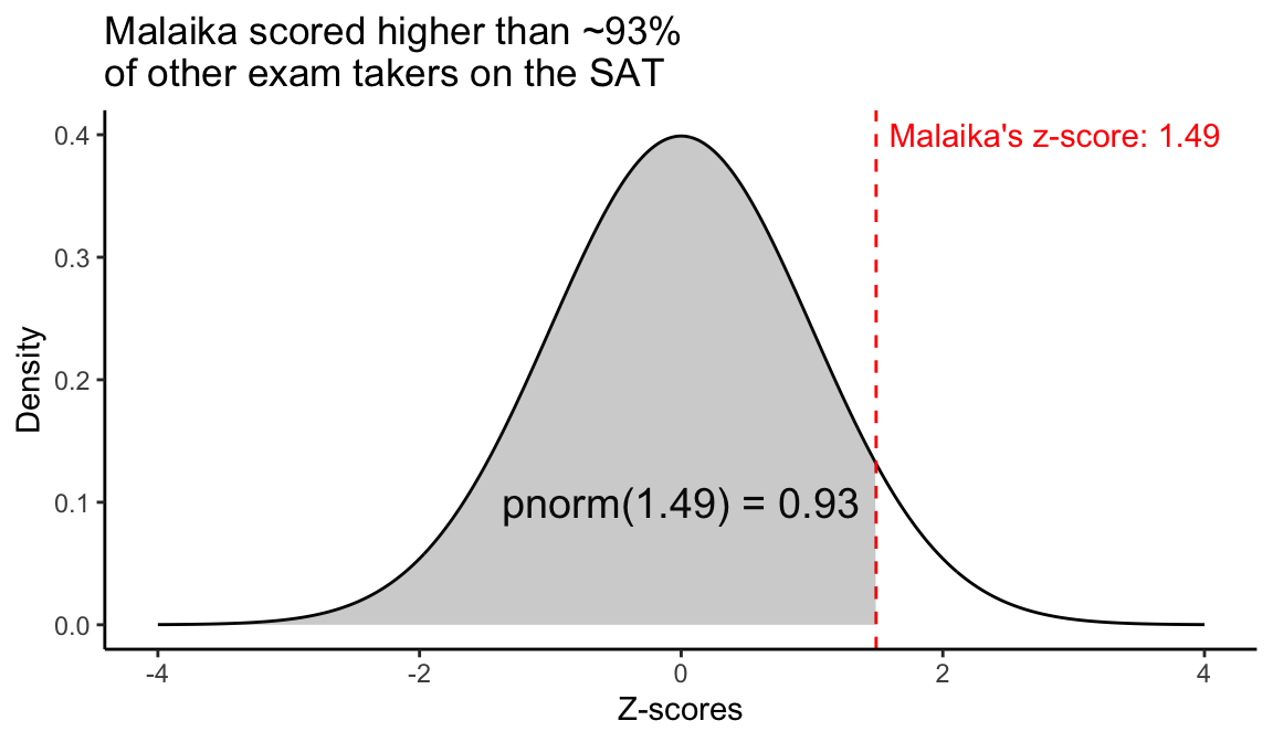
Note that if we want the fraction of the data to the right of a value \(q\), we can subtract the value from one (1 - pnorm(1.49)) or set the lower.tail = FALSE argument in in pnorm.
18.10 Cutoff points
When we use the
pnorm()function we specify a point, \(q\), and it gives us the corresponding fraction of values, \(p\), that fall below that point in a normal distibutionIf instead we want to specify a fraction \(p\), and get the corresponding point, \(q\), on the normal distribution, we use the
qnorm(p, mu, sigma)function.
# To get the 75-th percentile (3rd quartile) of SAT scores
# based on the parameters provided previously
qnorm(0.75, 1060, 195)
#> [1] 1191.526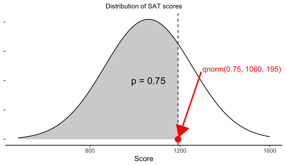
18.11 Assessing normality
There are a number of graphical tools we have at our disposal to assess approximate normality based on observations of a variable of interest. There are also some formal tests we can apply. Here we focus on the graphical tools.
18.11.1 Comparing histograms to theoretical normals
One of the simplest approaches to assessing approximate normality for a variable of interest is to plot a histogram of the observed variable, and then to overlay on that histogram the probability density function you would expect for a normal distribution with the same mean and standard deviation.
In the example below I show a histogram of heights from a sample of 100 men, overlain with the PDF of a normal distribution with the mean and standard deviation as estimated from the sample.
The histogram matches fairly well to the theoretical normal, but histograms are rather course visualizations when sample sizes are modst.
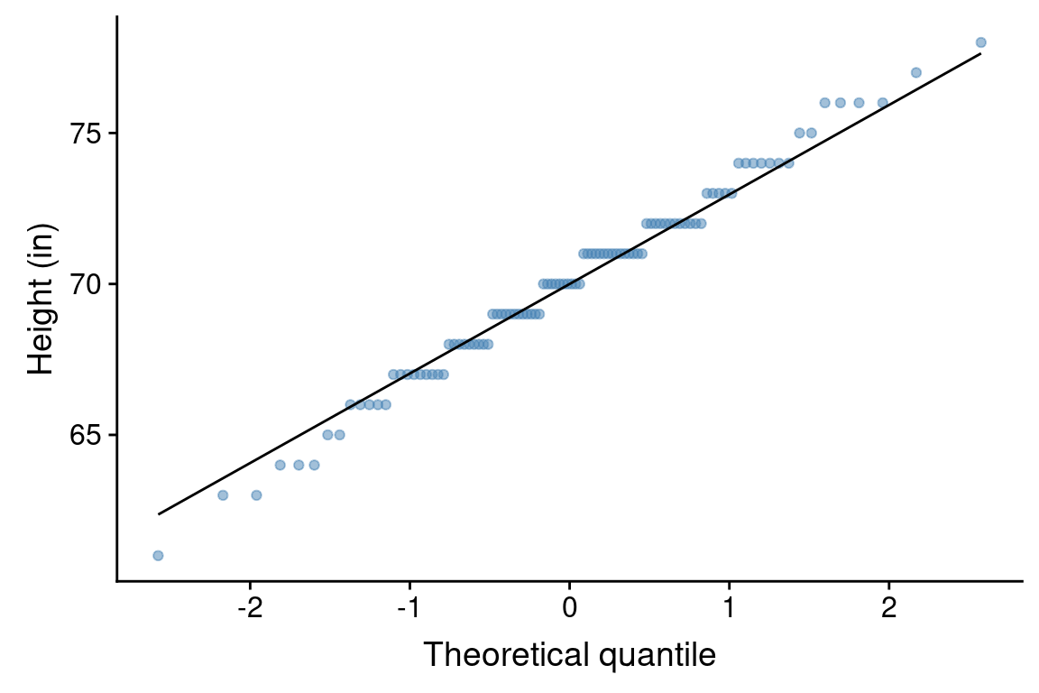
18.11.2 Normal probability plot
A second graphical tool for assessing normality is a “normal probability plot”. A normal probability plot is a type of scatter plot for which the x-axis represents theoretical quantiles of a normal distribution, and the y-axis represents the observed quantiles of our observed data. If the observed data perfectly matched the normal distribution with the same mean and standard deviation, then all the points should fall on a straight line. Deviations from normality are represented by runs of points off the line.
The ggplot functions geom_qq() and gome_qq_line() take care of the necessary calculations required to generate a normal probability plot. Here is the normal probability plot for the male height data:
This plot suggests that the male heights are approximately normally distributed, though there are maybe a few more very short men and a few less very tall men in our sample then we would expect under perfect normality.
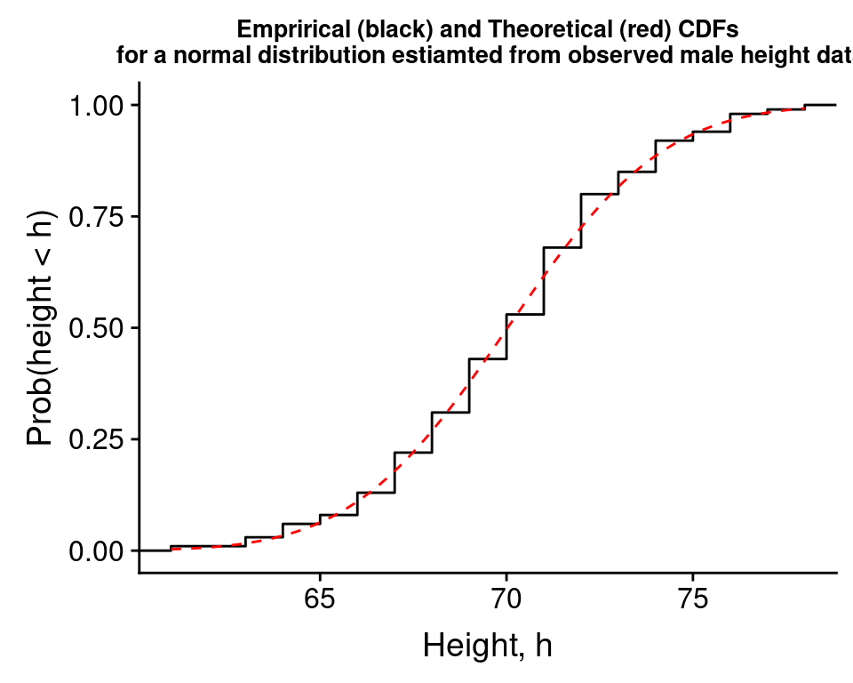
18.11.3 Comparing the empirical CDF to the theoretical CDF
A third visual approach is to estimate a cumulative distribution function (CDF) for the variable of interest from the data and compare this to the theoertical cumulative distribution function you’d expected for a normal distribution (as provided by pnorm()). When you estimate a cumulative distribution function from data, this is a called an “empirical CDF”.
The function ggplot::stat_ecdf estimates the empirical CDF for us and plots it, we can combine this with stat_function() to plot the theoertical CDF using pnorm, as shown below for the height data.
male.heights %>%
  ggplot(aes(x = heights)) +
  stat_ecdf() +
  stat_function(fun=pnorm,
                args=list(mean = mean.height, sd = sd.height),
                color='red', linetype='dashed', n = 200) +
  labs(x = "Height, h", y = "Prob(height < h)",
       title = "Emprirical (black) and Theoretical (red) CDFs\n for a normal distribution estiamted from observed male height data") +
theme(plot.title =element_text(size=10)) 
Here the match between the empirical CDF and the theoretical CDF is pretty good, again suggesting that the data is approximately normal.